How to Use Gini, Cumulative Accuracy Profile, and AUC on Statistics Assignments

Claim Your Offer
Unlock a fantastic deal at www.statisticsassignmenthelp.com with our latest offer. Get an incredible 10% off on all statistics assignment, ensuring quality help at a cheap price. Our expert team is ready to assist you, making your academic journey smoother and more affordable. Don't miss out on this opportunity to enhance your skills and save on your studies. Take advantage of our offer now and secure top-notch help for your statistics assignments.
We Accept


- Understanding the Gini Coefficient in Classification Problems
- What the Gini Coefficient Represents in a Model Evaluation Context
- How to Interpret Gini Scores in Assignments
- How to Use the Cumulative Accuracy Profile (CAP) in Model Evaluation
- What the CAP Curve Shows
- How to Construct and Analyze CAP Curves in Assignments
- How AUC Complements Gini and CAP in Classification Metrics
- Why AUC Is a Robust Metric
- How AUC, Gini, and CAP Interact
- How to Apply These Metrics in Statistics Assignments
- Step-by-Step Workflow for Metric Evaluation in Assignments
- Interpreting and Presenting Results in a Student-Friendly Format
- How to Avoid Common Mistakes While Using Gini, CAP, and AUC
- Misinterpretation of Metrics
- Overlooking Data Preparation Steps
- Conclusion
Model evaluation is a critical component of any predictive analytics workflow, especially in classification problems. For students working on Statistics assignments, understanding how to measure and compare model performance using metrics such as the Gini coefficient, Cumulative Accuracy Profile (CAP), and Area Under the Curve (AUC) is essential. These tools offer insights into the effectiveness of models, particularly in imbalanced datasets where simple accuracy may be misleading. Whether you're working on academic exercises or practical case studies, knowing how to apply these metrics can help you solve your statistics assignment more effectively. This blog explores how these concepts work, how they are calculated, and how they should be interpreted in assignments involving classification models.
Understanding the Gini Coefficient in Classification Problems
The Gini coefficient, commonly used in economics to measure income inequality, also finds significant application in model performance evaluation. In Statistics assignments, it's frequently used alongside the AUC to quantify classification model accuracy.
What the Gini Coefficient Represents in a Model Evaluation Context

In classification, the Gini coefficient quantifies the inequality in model performance. It is derived directly from the ROC curve and reflects the concentration of true positives among the predicted positives. A higher Gini score means better separation of classes by the model.
Mathematically, the Gini coefficient is calculated as:
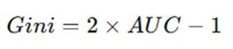
This implies that a model with an AUC of 0.5 (random classifier) will have a Gini of 0, and a perfect model (AUC = 1) will have a Gini of 1.
How to Interpret Gini Scores in Assignments
In student assignments, interpreting Gini should go beyond reporting the number. For example:
- Gini close to 0: Model has no discriminatory power.
- Gini between 0.2 to 0.4: Acceptable for moderately complex problems.
- Gini above 0.5: Strong predictive model.
Including a comparative analysis of Gini scores across multiple models (like logistic regression vs. random forest) can strengthen your assignment's credibility.
How to Use the Cumulative Accuracy Profile (CAP) in Model Evaluation
The Cumulative Accuracy Profile (CAP) is a visual tool that evaluates a classifier's ability to identify true positives early in the prediction ranking.
What the CAP Curve Shows
The CAP curve plots the cumulative percentage of positives identified (y-axis) against the cumulative percentage of total observations (x-axis). There are three lines in a typical CAP chart:
- Random Model Line: A diagonal line from (0,0) to (1,1).
- Perfect Model Line: Jumps vertically to the total proportion of positives and then moves horizontally.
- Model Line: Actual performance of the model.
The closer the model curve is to the perfect line, the better the model.
How to Construct and Analyze CAP Curves in Assignments
In assignments, CAP curves are best used in problems where class imbalance exists (e.g., fraud detection). Steps to include:
- Sort data by predicted probabilities (descending).
- Plot the cumulative percentage of positives captured against population.
- Overlay the random and perfect model curves.
Discussion can include:
- Proportion of population needed to capture 80% of positives.
- Area under the CAP curve relative to the perfect and random curves.
How AUC Complements Gini and CAP in Classification Metrics
Area Under the ROC Curve (AUC) is perhaps the most widely used metric to evaluate classification performance. It summarizes how well a model can distinguish between classes.
Why AUC Is a Robust Metric
Unlike accuracy, AUC is not sensitive to class imbalance. An AUC of:
- 0.5 implies random guessing,
- 0.7 suggests decent performance,
- 0.9 implies excellent class separation.
AUC evaluates the trade-off between the true positive rate and false positive rate across thresholds, making it more comprehensive than fixed-threshold accuracy.
How AUC, Gini, and CAP Interact
In assignments, students often calculate all three metrics. It's important to highlight that:
- Gini is derived from AUC: Gini = 2 × AUC - 1
- CAP visually complements AUC: AUC is about threshold variability; CAP emphasizes early identification of positives.
Assignments can benefit from showing how AUC validates insights from both Gini and CAP analyses.
How to Apply These Metrics in Statistics Assignments
In real-world assignments, especially those involving binary classification, these metrics should be applied methodically. The key is in interpretation and synthesis, not just computation.
Step-by-Step Workflow for Metric Evaluation in Assignments
- Build the Model: Train a logistic regression, decision tree, or ensemble method.
- Generate Probabilities: Use predict_proba() or equivalent.
- Calculate AUC: Use roc_auc_score() in Python (Scikit-learn).
- Compute Gini: 2 × AUC - 1
- Plot CAP Curve: Use cumulative proportions and matplotlib/seaborn.
Each step should be documented and justified in assignments, with emphasis on results interpretation.
Interpreting and Presenting Results in a Student-Friendly Format
When reporting, go beyond the numbers:
- Use tables to compare metrics across models.
- Plot graphs to visually support your conclusions.
- Discuss why one model outperforms another and what the trade-offs are.
Explain technical terms clearly. For example: "The model's AUC of 0.86 indicates that there is an 86% chance it will rank a randomly chosen positive instance higher than a randomly chosen negative one."
How to Avoid Common Mistakes While Using Gini, CAP, and AUC
While these tools are powerful, students often misuse or misinterpret them. Here are typical errors and how to avoid them in your assignments.
Misinterpretation of Metrics
- Confusing Gini with economic inequality Gini: Make sure to clarify it's a classification metric.
- Assuming higher AUC always means better model: AUC is threshold-independent but may not suit all problems. Precision-recall AUC may be better in highly imbalanced cases.
Always relate metrics back to the assignment's context.
Overlooking Data Preparation Steps
Metrics are only as good as the inputs. Ensure:
- Predicted probabilities are correctly calculated.
- Data is cleaned and standardized where necessary.
- Models are validated (cross-validation or test set).
Assignments that explain these steps tend to score higher because they reflect sound statistical practice.
Conclusion
Evaluating classification models using Gini coefficient, Cumulative Accuracy Profile (CAP), and Area Under the Curve (AUC) is fundamental for students tackling Statistics assignments. These metrics not only offer a numeric score of model performance but also provide visual and comparative tools that deepen the interpretation. While AUC is a versatile and commonly used metric, combining it with Gini and CAP can offer a richer understanding of how well a model ranks and separates classes—especially in the presence of class imbalance. In student assignments, showing a clear grasp of these concepts through correct computation, plotting, and interpretation will strengthen the analysis and demonstrate advanced statistical understanding.
By properly calculating and interpreting these metrics, students can evaluate not just how accurate their model is but how useful it is for decision-making. Whether you're building credit risk models, medical diagnostics, or customer churn predictions, Gini, CAP, and AUC help convey the predictive power in a tangible, objective way. When used together and correctly, they serve as a solid foundation for any classification-based statistical analysis.