
Problem Description
This Data Visualization using R Programming assignment&involves creating informative graphics using SAS Studio, focusing on various datasets. The objective is to generate visualizations that reveal insights and patterns within the data. By implementing SAS Studio, students will create these visualizations and interpret their findings, demonstrating proficiency in interactive dashboard creation in R programming. This assignment empowers students to enhance their data analysis and visualization skills while summarizing their observations for better comprehension.
Assignment Solution:
Question 1:
SAS Code
PROC SGPANEL DATA = SASHELP.HEART NOAUTOLEGEND;
PANELBY BP_Status / NOVARNAME COLUMNS = 3 ONEPANEL;
VBAR Chol_Status / RESPONSE = MRW STAT = MEAN GROUP = Chol_Status;
ROWAXIS GRID;
RUN;
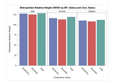
Fig 1: Bar Graph- Metropolitan Relative Weight by Cholesterol Status
From the graph above, it was found that the mean MRW was highest in High BP_Status. The rate keeps reducing as you move from High to normal and from normal to optimal.
Question 2:
SAS Code
TITLE 'Systolic Blood Pressure BY Weight and Sex';
PROC SGPANEL DATA = SASHELP.HEART;
VBOX systolic / CATEGORY = sex;
ROWAXIS GRID;
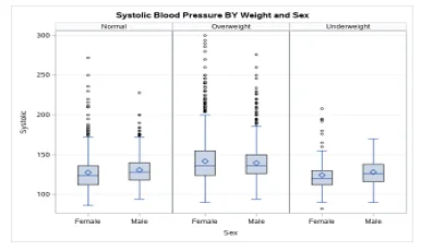
Fig 2: Boxplot- Systolic blood pressure by weight and sex
The data had a lot of observations that lied an abnormal distance from other values in a random sample from a population. The outliers were seen mostly for those with normal weight and those who were overweight. There was lesser dispersion od the data as seen by the thin box plots. The median is also in the middle of the boxplot indicating normal distribution in the data. The Overweight individuals (both male and female) had a higher systolic blood pressure as compared to the other weight status.
Question 3:
SAS Code
TITLE 'Mileage by Horsepower and Weight';
PROC SGSCATTER DATA=SASHELP.CARS(WHERE=(type IN ('Sedan' 'Sports' 'SUV')));
LABEL mpg_city = 'City';
LABEL mpg_highway = 'Highway';
COMPARE X = (mpg_city mpg_highway) Y = (horsepower weight) /
TRANSPARENCY = 0.3 MARKERATTRS = GRAPHDATA1(SYMBOL=CIRCLEFILLED);
RUN;
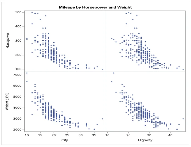
Fig 3: Scatter plot of mileage by horsepower and weight
From the comparative scatterplot constructed above, we compared the relationship between the Mileage per Gallon variables to Horsepower and weight in LBS. The analysis was conducted in four scatterplots. The second scatter plot explained the relationship between horsepower and highway. The same scale was used to measure the mileage per gallon. Weight was measured on a scale from 2000 to above 7000, while the horsepower was measured between 100 to 500. There was a negative correlation between the four factors. The strength of the relation differed. However, it was clearly seen that the relation between Weight and High negative relation.
Question 4:
SAS Code
TITLE 'Distribution of Body Mass Index (BMI) of Adult Men';
PROC SGPLOT DATA=SASHELP.BMIMEN(WHERE = (Age >= 18));
HISTOGRAM BMI;
DENSITY BMI / LINEATTRS = (PATTERN = SOLID);
DENSITY BMI / TYPE = KERNEL LINEATTRS = (PATTERN = SOLID);
KEYLEGEND / LOCATION = INSIDE POSITION = TOPRIGHT ACROSS = 1;
YAXIS OFFSETMIN = 0 GRID;
RUN;
 of adult men.webp)
Fig 4: Histogram for the percentage of the Body mass index (BMI) of adult men
The histogram for the percentage of the Body mass index (BMI) was a classical bell-shaped, symmetric histogram with most of the frequency counts bunched between a BMI of 25 to 35 and with the counts dying off out in the tails. From the superimposed density curve, It was observed that it was always on or above the horizontal axis and has area exactly 1 underneath it.
Question 5:
SAS Code
TITLE 'Scatterplot Matrix for HEART Data';
PROC SGSCATTER DATA=SASHELP.HEART(WHERE = (WEIGHT_STATUS = 'Normal'));
LABEL Cholesterol = 'Cholesterol';
LABEL Systolic = 'Systolic BP';
LABEL Diastolic = 'Diastolic BP';
LABEL weight = 'Weight';
MATRIX Cholesterol Systolic Diastolic weight /
TRANSPARENCY=0.7 MARKERATTRS=GRAPHDATA3(SYMBOL=CIRCLEFILLED);
RUN;
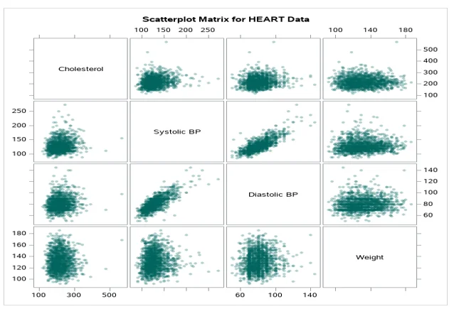
Fig 5: Scatter plot matrix for heart data
There was a single cluster for each group indicating a single group for each relationship. In both scenarios, there were outliers in the dataset for the relationships.
Question 6:
SAS Code
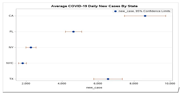
Fig 6: Average COVID-19 Daily New Cases by State
We realized that the 95% confidence interval was high for CA and TX. NYC and NY had the shortest 95% confidence interval. CA had an average new case of 9000, TX had an average of 6800, FL had an average of 5000.
Bonus Question:
For this question, your task is to create a Dot Plot displaying the average of COVID-19 new deaths by states (CA, FL, IL, OH, and TX) based on “Covid19DataCDC.xlsx” file.
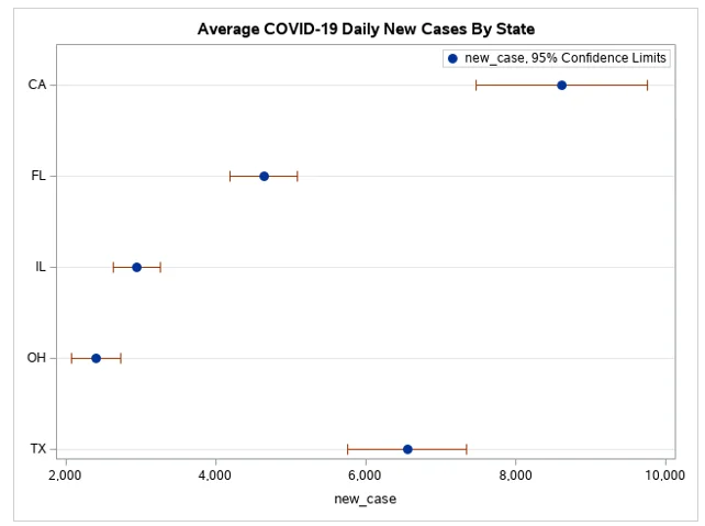
Fig 7: Dot Plot Displaying Average COVID-19 new deaths by states
The average order for the new cases of COVID-19 for the different states in the order for the countries given are CH, IL, FL, TX, CA. We also realized that the 95% confidence interval was high for CA and TX. CH and IL had the shortest 95% confidence interval. CA had an average new case of 9000, TX had an average of 6800, FL had an average of 5000.