
Problem Description
This Data Analysis assignment delves into the analysis of diverse datasets. It encompasses the investigation of social media usage patterns and demographics, the profiling of CEOs across continents, Autoliv's data-driven quality improvement process, and in-depth examination of bond risk and returns. The task involves collecting and interpreting data to uncover meaningful insights in these four distinct areas of study.
Part 1: Analyzing Social Media Usage and Demographics
In this section, we aim to understand social media usage patterns and demographics among a survey group. The data collected encompasses information related to social media platform usage, demographics, and frequency of usage.
Solution:
- Key Social Media Platform and Demographics: To analyze social media usage and demographics, we collected the following data types:
- Key social media platform used: This variable is categorical, indicating the primary social media platform respondents use.
- Frequency of social media usage: This numerical variable represents how often respondents use social media. It is discrete but can also be categorized into less frequent, somewhat frequent, or more frequent.
- Demographics: Demographics are a mix of categorical and numerical data. For instance, gender is categorical (Male/Female), while variables like age and annual income are numerical and discrete.
- Survey Questions: We designed a set of survey questions to collect data. The questions include:
- What is your gender: Male ( ) Female ( )
- What is your highest educational qualification: Respondents can choose from options like less than high school, high school, some college, BSc or equivalent, MSc or equivalent, Ph.D. or equivalent.
- Which social media do you use (Tick all that apply): Respondents can tick the social media platforms they use, such as Facebook, Twitter, Whatsapp, Telegram, Instagram, Discord, or specify others.
- How frequently do you visit social media: Respondents can select from less frequently, somewhat frequently, or more frequently.
- What is your most frequently used device to visit social media: Respondents can choose from options like Android Phone, iPhone, PC, or specify others.
- Additional Demographic Questions: In addition to social media-related questions, we collected demographic information including:
- What is your age in years: Respondents specify their age.
- What is your annual income: Respondents specify their annual income.
- How many times do you visit social media per day: Respondents specify the frequency of their daily visits to social media.
- How many social media platforms do you visit per day: Respondents specify the number of social media platforms they visit daily.
- What is the estimated cost of data used in visiting social media per day: Respondents specify the estimated daily cost of data usage for social media.
This comprehensive data collection and structured questionnaire provide insights into social media usage patterns and the demographics of the surveyed population.
Part 2: Analyzing CEOs from Different Continents
In this part, we explore data related to CEOs from various industries in Asia, Europe, and the Americas to understand their profiles and characteristics.
- Population and Sample: The population of interest consists of CEOs from all industries in Asia, Europe, and the Americas. We collected a sample of 1,379 CEOs from different industries and company sizes across these regions.
- Parameter and Statistic: Our parameter of interest is the proportion of CEOs with specific characteristics, and the statistic used to analyze the data is percentages.
This approach allows us to draw insights about CEOs' characteristics and their distribution across regions and industries.
Part 3: Autoliv's Data Collection and Analysis
In this section, we delve into how Autoliv collects and uses data for quality improvement and product specification verification.
- Data Collection Purpose: Autoliv collects data to ensure incremental improvement in quality and production processes, as well as to verify that products meet specifications. This includes data from the injection molding process and product weight.
- Use of Samples: Autoliv uses samples because it is impractical to assess every product. Different sample sizes reveal unique issues that may not be apparent in the entire population. Moreover, collecting extensive data would be costly and require specialized resources.
- Data Presentation: Autoliv employs various chart types to present data, including Histograms, Box/Violin plots, line charts, and scatter plots. These visual representations help in understanding the data distribution and identifying trends or anomalies.
- Example of Data Discovery: For instance, Autoliv used graphs to compare the weights of products produced by two machines. While both machines produced the same product, the weight graphs revealed disparities, indicating that the weights were not uniform.
This data-driven approach ensures product quality and process improvement at Autoliv.
Part 4: Data Analysis of Bond Risk and Returns
In this part, we analyze data related to bond risk, bond types, fees, returns, and their distribution.
Analysis of Bond Risk:
| Risk | frequency | percent |
|---|---|---|
| Above average | 59 | 32.07% |
| Average | 69 | 37.50% |
| Below average | 56 | 30.43% |
| Grand Total | 184 | 100.00% |
Table 1: Bonds Risk Categories
The table provides insights into the distribution of bond risk categories. It is evident that bonds with "average risk" make up the highest proportion, followed by "above average" and "below average" risk bonds.
Analysis of Bond Types and Fees:
| No | Yes | Total | ||||||||||
|---|---|---|---|---|---|---|---|---|---|---|---|---|
| Type | frequency | Overall % | Row% | Column % | frequency | Overall % | Row% | Column % | frequency | Overall % | Row% | Column % |
| Intermediate Government | 53 | 28.80% | 40.77% | 60.92% | 34 | 18.48% | 62.96% | 39.08% | 87 | 47.28% | 47.28% | 100.00% |
| Short Term Corporate | 77 | 41.85% | 59.23% | 79.38% | 20 | 10.87% | 37.04% | 20.62% | 97 | 52.72% | 52.72% | 100.00% |
| Grand Total | 130 | 70.65% | 100.00% | 70.65% | 54 | 29.35% | 100.00% | 29.35% | 184 | 100.00% | 100.00% | 100.00% |
Table 2: Bond types and fund fees within each category
The table breaks down the data to reveal that 70.65% of the funds have fees, while 29.35% do not. It also highlights the distribution of bond types and fees within each category.
Analysis of Returns:
| Range | frequency |
|---|---|
| <=0 | 7 |
| 0.1-1.9 | 14 |
| 2-3.9 | 25 |
| 4-5.9 | 81 |
| 6-7.9 | 53 |
| 8-9.9 | 4 |
| total | 184 |
Table 3: Frequency distribution of returns within specific ranges
This section presents the frequency distribution of returns within specific ranges, indicating that returns between 4% and 5.9% are the most frequent.
Relative Frequencies:
| Range | relative frequency | percentage |
|---|---|---|
| <=0 | 0.038 | 3.804 |
| 0.1-1.9 | 0.076 | 7.609 |
| 2-3.9 | 0.136 | 13.587 |
| 4-5.9 | 0.440 | 44.022 |
| 6-7.9 | 0.288 | 28.804 |
| 8-9.9 | 0.022 | 2.174 |
| total | 1 | 100 |
Table 4: Relative frequencies and percentages for returns
The relative frequencies and percentages for returns are calculated and presented. Returns between 4% and 5.9% are the most prevalent.
Pareto Chart:
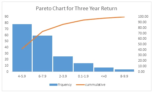
Fig 1: Pareto chart for three year return
A Pareto chart is used to visually depict that over 70% of bonds have returns between 4% and 7.9%.
Bar and Pie Charts:
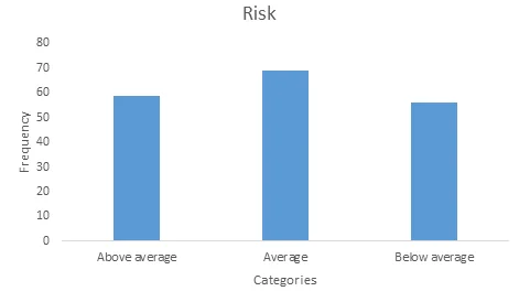
Fig 2: Bar chart showing the proportion of risk for each category
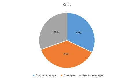
Fig 3: Pie chart showing the proportion of risk for each category
Both bar and pie charts provide a visual representation of risk categories. The data shows that the majority of bonds are of "average risk."
Chart Preferences:
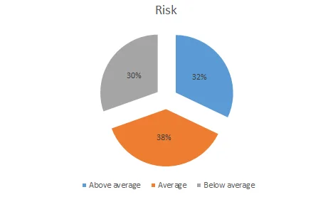
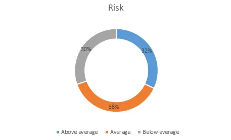
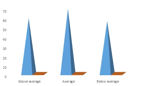
Fig 4: Exploded pie charts presenting the results in percentage terms
Exploded pie charts are preferred for their aesthetics and the presentation of results in percentage terms.
Analysis of Fee Disparity:
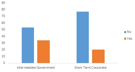
Fig 5: Plot illustrating the disparity in fees between intermediate government bonds and short-term corporate bonds
A plot illustrates the wider disparity in fees between short-term corporate bond funds compared to intermediate government bond funds.
Skewness of Three-Year Return: The data reveals that the three-year return for intermediate government bonds is more skewed than corporate bond funds, indicating potential investment risks.
This comprehensive analysis of bond risk and returns enables informed investment decisions.