
Problem Description
In this comprehensive statistical analysis assignment, students are tasked with analyzing data and presenting findings using various statistical and visualization techniques. They will create descriptive reports based on frequency distribution tables, report on cross-tabulations and chi-square analyses, interpret the results of a multiple regression analysis, and describe scenarios in variance-covariance visualization. This assignment tests their ability to apply statistical knowledge to real-world data and communicate their findings effectively.
Assignment 1: Descriptive Report Based on Frequency Distribution Tables
The objective of this assignment is to analyze and present the frequency distribution of categorical variables, namely Marital Status, Spouses' Highest Degree, and Race of Respondent. The goal is to provide a comprehensive report with detailed tables and meaningful conclusions.
Table 1: Frequency Distribution for Marital Status The first table presents the distribution of respondents' Marital Status. It is a crucial demographic variable that provides insights into the marital status of the surveyed population.
| Value Label | Frequency | Percent |
|---|---|---|
| Married | 424 | 47.01 |
| Widowed | 67 | 7.43 |
| Divorced | 158 | 17.52 |
| Separated | 36 | 3.99 |
| Never Married | 215 | 23.84 |
| NA | 2 | 0.22 |
| Total | 902 | 100.0 |
Table 1: Frequency Distribution for Marital Status
Table 1 Description:
- Married individuals represent the largest group, accounting for 47.01% of the respondents.
- The second-largest group is those who were never married at 23.84%.
- Divorced individuals make up the third-largest group at 17.52%.
- People who are separated have the lowest representation at 3.99%.
- A very small percentage (0.22%) is labeled as "NA," which may signify missing data.
Table 2: Frequency Distribution for Spouses' Highest Degree The second table provides insights into the educational background of the spouses of the respondents.
| Value Label | Frequency | Percent |
|---|---|---|
| LT High School | 47 | 5.21 |
| High School | 126 | 13.97 |
| Junior College | 23 | 2.55 |
| Bachelor | 51 | 5.65 |
| Graduate | 23 | 2.55 |
| NAP | 630 | 69.84 |
| DK | 1 | 0.11 |
| NA | 1 | 0.11 |
| Total | 902 | 100.0 |
Table 2: Frequency Distribution for Spouses' Highest Degree
Table 2 Description:
- The majority of spouses (69.84%) have an educational level labeled as "NAP," which suggests no academic progress.
- The next most common educational level is High School at 13.97%.
- Junior College and Graduate levels are the least represented, each at 2.55%.
Table 3: Frequency Distribution for Race of Respondent The third table illustrates the racial composition of the respondents.
| Value Label | Frequency | Percent |
|---|---|---|
| White | 665 | 73.73 |
| Black | 127 | 14.08 |
| Other | 110 | 12.20 |
| Total | 902 | 100.0 |
Table 3: Frequency Distribution for Race of Respondent
Table 3 Description:
- The largest racial group among the respondents is White, accounting for 73.73%.
- Black respondents represent 14.08% of the sample, while those categorized as "Other" make up 12.20%.
Conclusions:
- The most frequent marital status among respondents is "Married," followed by "Never Married" and "Divorced."
- Spouses with "NAP" education level are the most common, while Junior College and Graduate levels are the least represented.
- "White" respondents significantly outnumber other racial categories.
Assignment 2: Report Based on Crosstabs and Chi-Square Analysis
This assignment requires the analysis of cross-tabulations and chi-square tests to understand relationships and significance in reported health status by region and gender.
Crosstabs on Reported Health Status by Region:
Crosstabs on Reported Health Status
| Excellent | 30.00% | 26.50% | 27.30% | 28.90% |
|---|---|---|---|---|
| Very good | 31.40% | 32.50% | 30.20% | 30.50% |
| Good | 27.00% | 28.60% | 28.00% | 28.80% |
| Fair | 9.50% | 9.60% | 10.60% | 9.10% |
| Poor | 2.20% | 2.80% | 4.00% | 2.70% |
Table: Crosstabs on Reported Health Status by Region
- Excellent Health Status: The Northeast region has the highest count of people reporting excellent health status, followed by the West, with the Midwest having the lowest percentage.
- Very Good Health Status: The Midwest region has the highest count of people reporting very good health status. The South region reports the lowest.
- Good Health Status: The West region reports the highest number of people in good health status, while the Northeast has the lowest representation.
- Fair Health Status: The South region has the highest count, and the West region has the lowest.
- Poor Health Status: The South region also has the highest count for poor health status, while the Northeast has the lowest.
Chi-Square Analysis:
| Sig (2-sided) | |
|---|---|
| Pearson chi-square | 0 |
| Likelihood ratio | 0.002 |
| Linear-by-linear association | 0.002 |
Table: Chi-Square Analysis
- The p-values for all chi-square tests are less than 0.05, indicating significant differences between regions in reported health status.
Symmetric Measures:
Symmetric Measures
| Value | Approx. sig | |
|---|---|---|
| Phi | 0.053 | 0 |
| Cramer’s V | 0.031 | 0 |
Table: Symmetric Measures
- The phi coefficient of 0.53 suggests a moderate correlation between variables.
Crosstab on Reported Health Status by Gender:
Crosstab
| Male | Female | |
|---|---|---|
| Excellent | 29.60% | 26.60% |
| Very good | 30.80% | 31.00% |
| Good | 27.50% | 28.70% |
| Fair | 9.10% | 10.50% |
| Poor | 2.90% | 3.30% |
Table: Crosstab on Reported Health Status by Gender
- Males have the highest count in excellent health status, while females have the highest count in very good, good, and fair health status. In poor health status, males have the highest count.
Chi-Square Analysis:
Chi-Square
| Sig (2-sided) | |
|---|---|
| Pearson chi-square | 0 |
| Likelihood ratio | 0 |
| Linear by linear association | 0 |
Table: Chi-Square Analysis
- P-values for chi-square tests are all less than 0.05, indicating significant differences between males and females in reported health status.
Symmetric Measures:
Symmetric Measures
| Value | Approx. Sig | |
|---|---|---|
| Phi | 0.39 | 0 |
| Cramer’s V | 0.39 | 0 |
Table: Symmetric Measures
- The phi coefficient of 0.39 indicates a weak positive correlation between the variables involved.
Conclusions:
- Regional differences significantly impact reported health status.
- Gender plays a role in reported health status, with females generally reporting better health across categories.
Assignment 3: Essay on Multiple Regression Analysis
This assignment involves interpreting the output of a multiple regression analysis to understand the effects of socio-economic factors on visiting elderly parents.
Multiple Regression Analysis Components:
- Sample: The analysis is based on a sample of 689 individuals who participated in the Family Survey Study.
- Population: The analysis aims to make inferences about the population of individuals with elderly parents.
- Variables: The independent variables include Age of Respondent, RS Highest Degree, Total Family Income, and Gender (coded as Male=1). The dependent variable is the occurrence of visiting elderly parents.
Findings:
- Model Summary: The R-square value of 0.273 indicates that the independent variables collectively explain 27.3% of the variance in visiting elderly parents. The adjusted R-square adjusts for the number of predictors in the model and is 0.269. The standard error of the estimate is 1.730.
- ANOVA: The p-value of 0.000 in the ANOVA table suggests that the regression model is statistically significant, indicating a difference in means between male and female respondents regarding visiting elderly parents.
- Unstandardized and Standardized Regression Coefficients: All variables have beta coefficients different from zero, indicating their statistical significance in predicting the occurrence of visiting elderly parents.
Conclusion: The multiple regression analysis indicates that socio-economic factors, including age, education level, total family income, and gender, have a significant impact on the occurrence of visiting elderly parents. The model explains approximately 27.3% of the variance in this behavior.
Assignment 4: Variance Covariance Visualization
Scenario 1
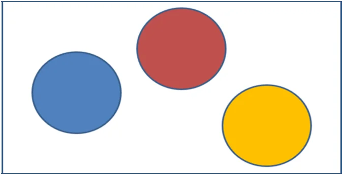
Fig 1: Scenario Visualization of variables X, Y and Z
Scenario 1 visualizes three variables (X, Y, and Z) without any apparent correlation. The circles representing the total variance of each variable do not overlap, suggesting that these variables are independent and do not exhibit a strong relationship.
Scenario 2:
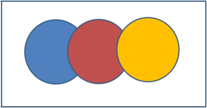
Fig 2: Scenario 2 visualization of variable X, Y and Z
In Scenario 2, there is a strong linear correlation between variables X and Y. The overlapping blue and yellow circles indicate that a substantial portion of the variance in both X and Y can be explained by their relationship, implying a positive linear correlation.
Scenario 3:
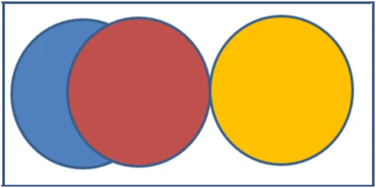
Fig 3: Scenario 3 visualization of variable X, Y, and Z
Scenario 3 displays a relationship between variables X and Z, as indicated by the overlap of the blue and red circles. However, variable Y does not show any correlation with the other two variables, suggesting that two variables exhibit a relationship while one remains independent.
Scenario 4:
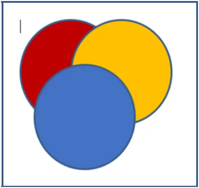
Fig 4: Scenario 4 Visualization of variable X, Y and Z
In Scenario 4, all three variables (X, Y, and Z) are inter-correlated. The significant overlap of the three circles implies complex relationships between these variables, and changes in one variable are associated with changes in the others.
These visualizations provide a comprehensive understanding of how variables interact and exhibit correlations, allowing for more insightful data analysis and interpretation.